Tap to Read ➤
Choosing Exterior House Paint
Anju Shandilya


It is very important to choose the right exterior paint scheme for your home. It should look new as ever, and not peel and turn flaky over a period of time. Here are a few tips on choosing the right exterior paint, and different types of color schemes.
One of my most favorite pastimes every evening is to take a walk with my husband through the various streets in my locality. We look at the different houses, and pick out pointers as to what we would like to have when we construct our own house.
Very often, we have come across houses that are aesthetically built but the exterior color of the house was horrendous. It becomes difficult to believe that somebody could punish a building so badly.
How to Choose an Exterior House Paint
To start off, whenever you decide on painting your house, choose reputable brands. There is no point in wasting time over low-quality paint. There are many differences between high-quality and low-quality paint, the prominent ones being hiding and wash ability.
Further, the higher quality of paints will be available in a wider range of color palette. Also, look for the warranty of the paint. This will give you a fair idea between the quality levels of various paints.

Color Schemes
It is rather difficult to understand how and why different colors work together to give a pleasing look. The four main types of schemes are as follows

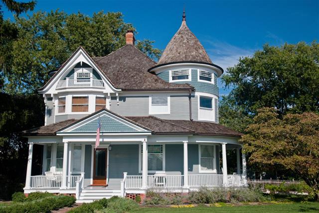
Monochromatic: The monochromatic schemes use just one shade. This color scheme is usually conservative and subtle. It tends to give a very sophisticated and elegant look. This approach is ideal for people who have just started experimenting with different shades.

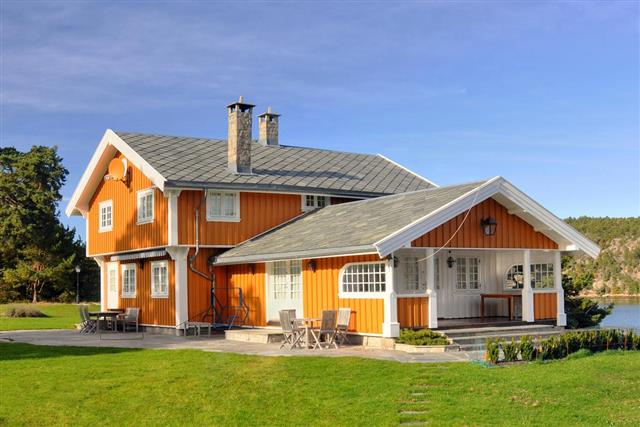
Complementary: In this scheme, tones that are opposite to each other on the color chart are chosen. For example, red and green are opposite to each other on a simplified color chart. Naturally, complementary colors have a great deal of contrast, and the resultant of using this scheme is a lively combination, that can be very bright too.

If you want to sober down a little, then you could choose a combination where one shade is dominant while the other one serves as an accent.
Triadic: This scheme uses three colors that are equidistant on the color chart. An example of this would be red-violet, yellow-orange, and blue-green. This scheme requires complex color treatments and a lot of experience to compose an aesthetically pleasing palette.
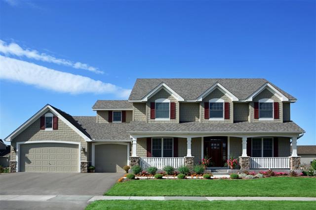
Adjacent: This scheme is also known as an analogous or related scheme, and uses shades that are next to each other, or close by on the color wheel. Usually, one of the three colors would be dominant while the other two would be accent colors.
This is a fairly simple scheme to create when compared to the triadic scheme, as there is inherent harmony in shades that are adjacent to each other on the color wheel.
Tips
Here are some tips that you can consider while deciding on the exterior house paint
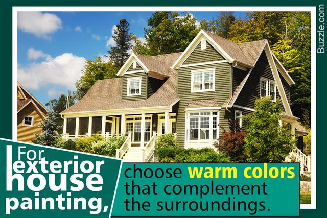
Neighborhood Context: You will have to consider the exterior paints used in your neighborhood, especially if all of them have followed a uniform scheme.
Neighborhood Context: You will have to consider the exterior paints used in your neighborhood, especially if all of them have followed a uniform scheme.
For example, if all the houses in your neighborhood are painted conservatively, then a fluorescent or Victorian-colored house will look completely out of place, and there will be a high possibility that it will invite a considerable amount of ridicule.
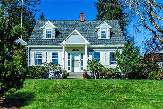
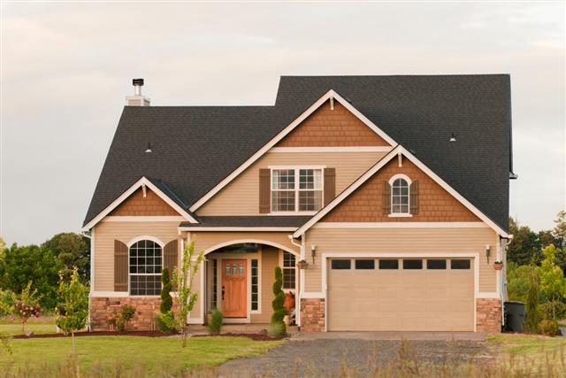
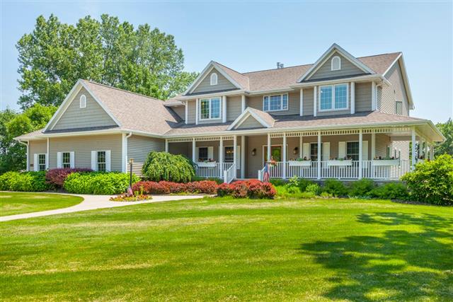
Existing Colors: There are certain colors that are already established in the house. For example, you will have to consider the shade of the roof, and that of the motor or any sides that will not be painted.
Also, you may choose not to have the doors and railings of the windows repainted. The new paint need not be the same as the existing one, but the color that you choose for the exterior paint should produce an overall harmony.
Durability: The darker the color of the house, the more likely it is to fade. A few years down the line, the deep reds and the vivid blues will appear faded. This is because the darker shades absorb heat, and also suffer greater moisture problems when compared to lighter ones.
Further, as it fades, it becomes very difficult to touch up. Hence, if you are very keen on darker shades, you will have to consider the possibility of repainting it in a few years.
Now, you have an idea about the different color schemes available, and what to keep in mind while choosing paints for your home exteriors. Go ahead and paint your home, making it beautiful and long-lasting too. All the best!